The recipe of good design

Let’s explore the art of the taste, the flavours and the aroma of your design.
The website is not just how beautifully it is designed, it is how effectively it functions for the users and audiences. Beautifully designed website may fail if it lacks the usability aspect.
“The design is not just what it looks like and feels like. The design is how it works” — Steve Jobs.
Below are some of the basic ideas to create a good web design.
1. Identify the purpose of website and goal to be achieved
A chef trying his new recipe would have a goal in his mind regarding how his new dish would taste and look alike. Similarly, for a good design, designers should have a goal in mind how the new design will look like & how it will work.
It would be always good to Start with The End in Mind.
Each business would have different objectives for their website and different goals to be achieved. But, most of those fall under the category of “business growth”. It is very important to understand the goals first.
The short-terms and long-terms goal of the website can be:
- Increase revenue
- Increase profitability
- Increase transactions & sales
- Generate qualified leads & enquiries
- Increase the conversion rates
- Increase brand awareness
- Improve customer satisfaction
- Improve the trust factor
2. Choose your elements to fulfil the purpose & accomplish the business goal
A good web design should be a combination of wisely chosen conversion elements put together with organisational goal in mind.
You are not simply designing an interface that is visually good and appealing. You are designing an interface that will be equally accessible & functional and focus on achieving a specific function.
How you can make the web design sync with the goal defined?
For example:
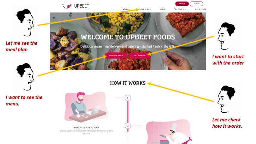
- Say your goal is to increase the brand awareness – make the ABOUT section on your landing page as clear and concise as possible
- Say your goal is to generate the qualified leads – highlight and ENQUIRE NOW call to action in top of the page clearly visible without the scroll and make it sticky so it doesn’t hide itself
- Say your goal is to improve the trust factors – highlight the customer testimonials or customer reviews on your landing page
Some of the other conversion focused designs elements are:
- Carefully selected banners & images and their placements
- Wisely chosen small texts & headlines (e.g. ‘Register Here’ can be improved to ‘Create a Free Account’)
- Buttons & Call to actions and their placements (e.g. Enquire Now, Contact Us, Add to Cart, etc.)
- Fonts & font sizes
- Colour combinations that makes the website visually appealing
- Search option on top
- LIVE Chat option
- Short webforms which users feels easy to fill up quickly
- Mobile First design approach
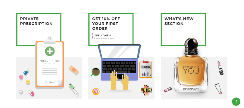
- Deals & Offers
These are just few examples which can lead your design to achieve business goals. The elements vary based on the goals defined. However, the strategy is consistent, it is to select & design your elements geared towards meeting the business goals.
3. Identify the information hierarchy & sequence of design elements that work for audience
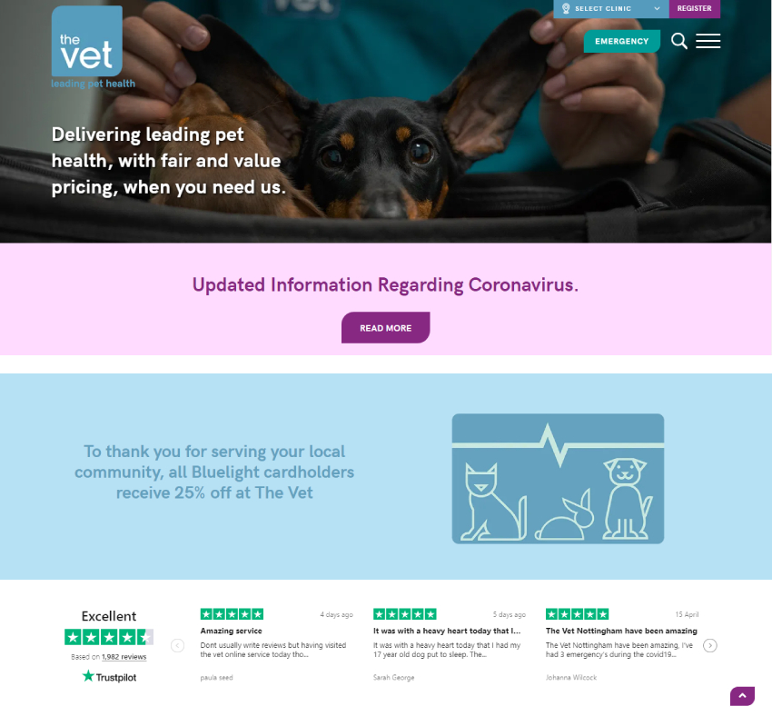
Visual hierarchy is a method of arranging design elements in order of importance.
A good web design is also an outcome of effective visual hierarchy of design elements. Effective visual hierarchy influences the audiences by providing pleasant experience and attracts the right attention. Visual hierarchy enable visitors to scan the information faster and communicates the message quickly.
How you arrange and prioritize design elements conveys valuable information about their relative importance.
Some of the concept to crate visual hierarchy are:
- Element Size & Scale
- Colour & Contrast
- Text Hierarchy
- Alignments
- Rule of Odd
- Rule of Third
- Visual Perspective, etc.
4. Don't make the user think
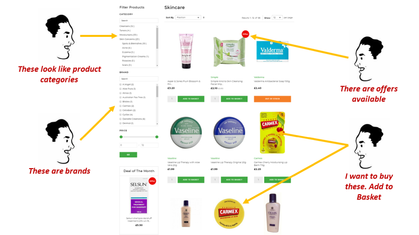
According to Steve Krug, first law of usability is “Don’t make users think”. The web design and design elements should be so obvious & self-explanatory that audience should not spent a second of time to identify ‘what it is?’ or ‘how it works?’. The web design should get rid of all questions in user’s mind and ease their decision making.
If the navigation, information architecture, visual hierarchies, design concept, etc. aren’t intuitive, the number of questions arise in users’ mind and make it difficult for them to arrive on any decision.
As number of questions increases, it also increases the cognitive load on the user. By reducing the cognitive load, you can make it easier for user to understand the design, make the decision making easy and ultimately leads to take action which solves the purpose of website and accomplish business goal.
A clean design, clear structure, best visual clues and easily recognizable call to actions can help users to find their way to their mission.
5. Understand that users do not read the pages, they scan the pages
It is very important to understand and keep in mind while web designing that majority of website visitors rarely read pages word-by-word, they scan the pages instead and picking individual words, phrases, slogans and sentences.
A good web design must cater for this behaviour of the audience and make the scanning easy for them.
Some of the concepts to make the page scanning easy are:
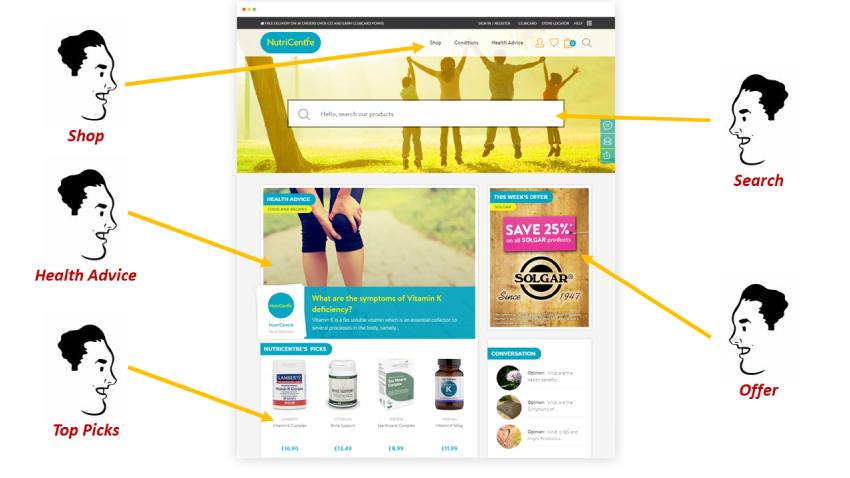
- Utilize the web design conventions which audience knows (e.g. placement of logo & navigation) and don’t reinvent the wheel
- Complement your designs with effective visual hierarchy
- Break up pages into clearly defined areas. It allows users to decide quickly which areas of the page to focus on and which they can safely ignore
- Highlight call to actions and make the clickable items so obvious
- Complement the designs with well-chosen texts, images & graphics
6. Put yourself in your customers' shoes and identify how they think
To make the design more effective, it is always good to think from customers’ perspective and speak customers’ language.
Usually, visitor visiting your website is on a mission and is looking for to get something done. Adopting a customers’ perspective, purpose & goal while interacting with is crucial.
Most visitors search for something useful and clickable based on the goal/mission they have in mind. They click as soon as something interesting found. Users are very impatient. If the website is not able to meet their expectation, they will move ahead and the company loses the business and money.
The role of good web design is to bring the organisational goal and the actions of visitors & potential customer as near as possible.
For good web design, it is very crucial to identify the design elements based on the organisational/business goal and arrange it so effectively that it aligns with the customers’ behaviour & fulfils the goal/mission and create WIN-WIN situation for both the organisation & the customer.
