How to Create an Engaging & Inspiring Call-to-Action on a Website

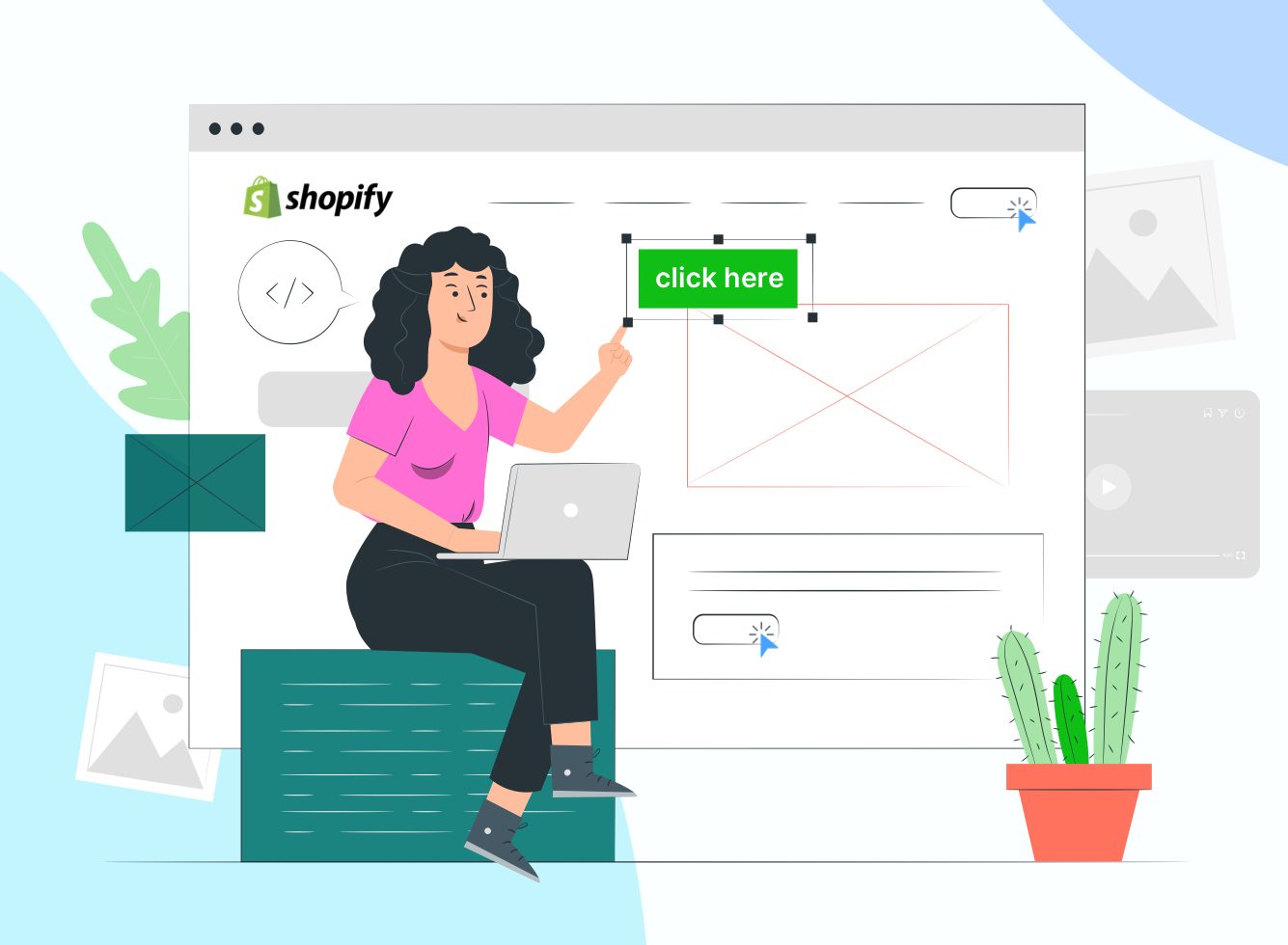
Either way, the best call-to-action buttons on Shopify stores stand out, grab attention, inspire your visitors to act, and ultimately become a customer. That’s easier said than done but we’ve got you covered with some tried-and-tested tips for creating a call-to-action on a website that works.
Top Tips for an Effective Call-to-Action on a Website
Your website is up and running and your products and services are listed. But there’s a problem. Recent data shows that your website is struggling to convert website visitors into customers. It could be an issue with the ecommerce CTA buttons and with a few simple tweaks you can ensure your Shopify store is firing on all cylinders.
Instil a sense of urgency
FOMO, or fear of missing out, is a real thing. Studies have shown that when consumers feel a sense of urgency, or that an offer is time-limited, they’re more inclined to make a purchase. So, to give your website conversions a push in the right direction, you could include a call-to-action button on Shopify that says, ‘Buy Now – Limited Stock’ or even ‘Shop Now – Sale Until Midnight’. While you don’t want to force your visitors to do anything, a little reminder that it won’t be around for long can do wonders for your bottom line.
Consider the words you use
A call-to-action on a website must motivate your visitors to act, and this all comes down to the words you use. While the tone of voice and copy needs to be relevant to your brand, aligning your call-to-action with some of the most effective phrases could level up your results. Buy Now, Join Free, Learn More and Add to Cart are some of the most successful calls-to-action on a website.
Be clever with colours
Like the wording that you use, the colour of your call-to-action button also needs to be on brand. However, there are certain colours that can evoke a more positive response. Gold can create feelings of wealth, orange is seen as friendly, blue has connotations related to trust and security, and purple depicts feelings of luxury. Whichever colour you choose for your button, be sure to use white space around it to make the button obvious. The call-to-action button on Shopify needs to stand out from the background so be sure not to use too many different colours.
Keep it simple
It’s not just the colour and wording of your call-to-action buttons that should be simple but also the design. Most Shopify themes allow you to create a call-to-action button instead of having a text link. Keep the box simple, include short text, and ensure that any animations or graphics don’t take away from what you’re trying to get your website visitors to do. Clear design and language are a great way to boost the user experience too.
Add hero images
A hero image is a large image or oversized banner that sits at the top of a web page. Commonly used to highlight a collection or product, it can also include text and clickable links. You can also use it as an attention-grabbing call-to-action. One study from Notre Dame University found that the first hero image in a rolling banner received more than 80% of clicks. Be sure to mix up your call-to-action design with standard buttons and linked hero images.
Keep it ‘above the fold’
Ask a Shopify website designer at a Shopify development agency about call-to-action best practices and they’ll likely tell you to keep it ‘above the fold’. In layman’s terms, the fold of a website is everything that can be seen after scrolling down. Content ‘above the fold’ is everything website visitors see when they immediately land on your Shopify store. That means if you can keep engaging content and an inspiring call-to-action up here, it’s likely to boost conversions.
Consider large mobile CTAs
Online shopping via mobile phones is growing in popularity with retail sales expected to surpass £100 billion by 2024. This stat alone highlights the importance of ensuring your Shopify store is optimised for mobile visitors and the call-to-action button is no different. Make sure the CTA button not only looks good but works well on a variety of devices. Additionally, ensure it spans the entire width of a mobile phone screen for best results.
It can also be beneficial to limit the number of widgets on your mobile Shopify store to avoid distractions. A Shopify website design agency can advise on strategic design and development of your mobile CTAs.
Be aware of CTA messaging
Think about when you’re searching for products or services online. Does a hard sell approach entice you, or push you away? ‘Shop Now’ and ‘Add to Cart’ are just two types of call-to-action buttons. There are plenty of other messaging options that inspire action and come across as less salesy. This includes CTAs that require your visitors to fill out a form as well as CTA buttons such as ‘Request a Demo’ and ‘Read More’. By using a variety of CTA messaging tactics, you’ll be better able to serve a range of visitors.
Use the right position, shape, and size
We’ve already mentioned the importance of the right wording for CTA UI design. Position, shape, and size are some of the other key considerations. The best CTA buttons are the ones that are eye-catching, displayed near the top of your Shopify store, simple in design, for example rectangle or rounded, and of a reasonable size compared to other elements on your website.
Partner with a Shopify development agency for successful CTAs
Calls-to-action are essential if you want your website visitors to convert into customers. After all, the main aim of a CTA is to inspire your visitors to act and highlight a route to sale. This isn’t always easy, however, and requires a call-to-action strategy and well-placed CTA buttons.
If you need any help, our Shopify development agency experts can advise on call-to-action best practices, including Shopify website design and the placement of your buttons. Armed with this information, you can design and develop successful CTAs and level up your business sales. Get in touch today to hire Shopify developers from Vsourz and benefit from specialist Shopify website design services.


