The ONE Ecommerce Factor That You Should Hold Dear Above All Others

Take a minute, close your eyes (or at least imaging closing your eyes, as reading the rest of this article could prove challenging). Try to imagine your website as a physical shop, with you the shopkeeper. The shelves are well full of product, and you are at the cash register waiting. The door opens, ringing an old-fashioned bell, and in walks the first customer of the day.
The potential customer takes a very quick look around but then leaves. This process is repeated many times for most of the morning. Customer after customer leaves and does not tell you why. Bored, you start counting the number of times the bell rings. Finally, one customer stays and buys something just before lunch time. Things are looking up. But in the afternoon more and more would-be customers enter and exit without any transaction taking place; some even have the cash in their hands. Just before you close for the day you secure another sale.
You tally up the number of rings (dividing by two, as they ring the bell on exit too). One hundred potential customers but only two actual payments.
Online ecommerce conversion rates typically range from 1 – 5% depending on the industry. You achieved a below par 2%. See below analysis from Adobe on conversion factors across various industries.
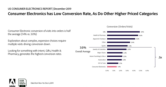
Image Source: Adobe
Please fully open your eyes now and promise yourself to learn how to improve ecommerce conversion rate optimisation, because it matters!
Which Conversion Rate Optimisation (CRO) strategy?
Having decided to improve your conversion rate, there is good news and bad news. The good news is that each element of improvement can be achieved quickly, unlike say SEO which can take months to reap the benefit. The bad news is that there are many elements that contribute to a great conversion rate, possibly 100 separate components.
Where to start Conversion Rate Optimisation?
Platforms such as WooCommerce, Shopify and Magento have various tools and reports to help prioritise conversion rate optimisation. It is possible to hire a conversion rate optimisation consultant or go to an ecommerce specialist, who build websites from the beginning with this important process built in.
Running a conversion report should highlight areas that need your attention. Recently we reviewed an ecommerce site selling personalised birthday cakes. Following the initial build, the site had been somewhat neglected. Customers would get to the payment page and probably miss the most important instruction on the entire website, the PAY NOW button!
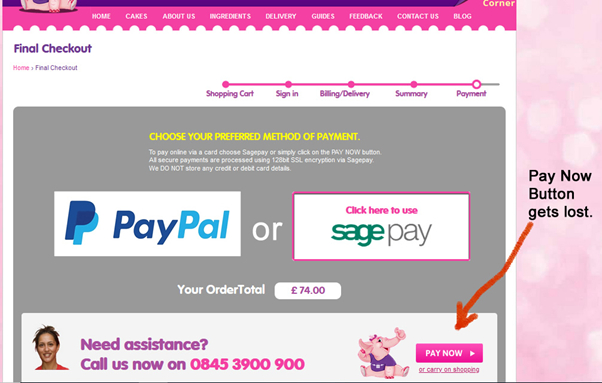
Image Source: London Cakes
Follow the Customer Journey
Having secured the quick wins such as size and location of the “Buy Now” buttons, a good methodology is to follow the customers planned route from browsing to completed sale. First consider where they came from:
- Content driven audience to a landing page.
- Paid for advertising and directly to a product page.
- General browsing and natural listing to the Home Page.
Each of these pages needs to be analysed and the ‘Call to Action” made clear. Bear in mind the mindset of the customer will likely be different depending on how they came to your website. A potential customer who read an article on
How Simple can We Make It?
In general, simple sites convert best, it is too easy to get caught up in the design phase and follow the latest web design trends which your customers may find confusing. The ideal scenario is to provide the customer with all the relevant information yet in a simple and concise way.
During a web build a customer wanted to add an overlay of a “video corner”. A triangle on each page where users could click through to a video library. The concept seemed fine, but the visitors to the site did not use it. Just because it seems like a good idea, does not mean it is. One very successful US based web company has the opposite approach, they try not to add any extra functionality asking: “Is it really necessary, will it enhance our user experience”?

Video Corner function detracted from Important Shopping Cart Information.
Image Source: London Cakes
Define Your Ecommerce Goal
Arguably for most businesses the goal is a purchase, “likes” and “follows” maybe part of that process but usually it is the customer who pays your bills. The simplest conversion rate can be defined thus: ‘The number of transactions for a specified time period, divided by the number of visitors to the site over the same period’. Be sure to specifically define “a visitor” and keep that definition consistent. We know of one business that used “Total Visitors” then changed to ‘Unique Visitors’. They improved their CRO on paper, but not in real terms.
Similarly define sales clearly, you may choose to include telephone orders or exclude them, just remain consistent and be confident that the data being collected is also consistent and accurate. Having got a handle on the headline conversion rate, you may then choose to look at the steps along the way of a customer journey:
- Added to shopping cart
- Added to Wish List
- Signed up for newsletter
- Completed Online form
- Added to CRM campaign
- Shared product or site on social media
Be aware of “paralysis by analysis”. Attempting to do all of these at the same time may cloud the picture. Remember what you are doing here:
Increase the Number of Successful Transactions for a Given Number of Visitors
Warning: Remember the oft quoted phrase: “There are three types of lies: lies, damned lies and statistics “. The numbers need to be analysed with common sense in mind. For example: One ecommerce client measured their CRO weekly and were consistently enjoying a 2.75% purchase to visitor ratio.
Then one month an alert sounded; the rate had dropped to less than 2% instantly one weekend. A look behind the numbers revealed that marketing had ran a Groupon campaign which flooded the site with visitors looking for a deal. These new shoppers did not convert as well however the campaign did generate extra revenue.
Vary the Content Depending on Customer Type.
A company selling BBQ equipment ran a successful content marketing campaign. On their site the published unusual BBQ recipes: Lamb and Apricot skewers, followed up with liquor fruit parcels.
On the recipe landing page was a call to action for discounted BBQ equipment.
Understanding that visitors were not that “hot” (excuse the pun), the offers were not the main feature of the page. However, if the customer came from a PPC advert with the headline “BUY discounted BBQ equipment in Southern California NOW”, it would be clear that customer had a “burning” desire to purchase. The call to action needs to be front and centre, or even better go directly to a Product Range page with highlighted time sensitive offers.
If the customer clicked on a “natural listing” about the company, then the Home Page, or the About Us page might be more appropriate. Remember to compare your Kiwi with Kumquat, sorry apples with pears, let us not change the expected norm, it just confuses people. The conversion rates for these 3 types of customer will be different, we want to improve on each customer type over time and may have completely different conversion percentages.
Test, Test and Then Test Again!
Everyone in ecommerce has an opinion, but there is only one opinion that should really concern an ecommerce manager. That is that opinion of the paying customer. Any conversion rate optimisation strategy should include looking at:
- Page headlines
- Sub-heading
- Navigational buttons
- Call to actions
- Button positions
- Button size
- Button colours
- Payment options
- Guest checkout
- Page layouts
- Text size and font types
This list is not exhaustive but is a good place to start.
The factors above can all be improved upon to achieving higher ecommerce conversion rates and need to be analysed. If you change too many items at once you may not be able to determine which is resulting in the gain or loss.
Is the Leaky Bucket Analogy Still Relevant?
As with the earlier shopper keeper analogy it may be helpful to have a visual picture of what is going to happen to the visitors to your site. A leaking bucket demands attention, few of us would continue to fill that bucket without first attending to the holes. The size of the hole and leakage also helps identify the order in which these issues should be addressed.
If some water has made it all the way to the bottom of the bucket and then leaks, it warrants your full attention. The equivalent in ecommerce terms is when a shopping cart is abandoned just before payment, this really needs looking at. So close but so far.
The concept of a leaky bucket can also be used to understand and implement “remarketing”. If some water has left the bucket it could be collected and added back to the top of the bucket, hopefully this time to not leak out.
Remarketing captures people leaving the site and offers them a reason to come back. The return visit can be prompted by a pop-up (if the user has not disabled them), by an emailed offer or by a display advert on partner sites. As with most areas of ecommerce, remarketing is constantly evolving so being kept informed of the latest concepts is essential.
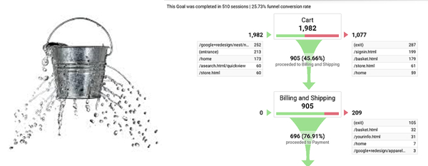
Image Source: OptinMonster and Invesp
Setting up an accurate Google Analytics funnel can graphically show where folk are leaving the journey you have planned for them.
Plugging these holes is effective ecommerce conversion. Unlike the bucket example, the process of ecommerce conversion is never finished. There will always be leakage. The latest surveys for 2020 report a global average of 2.86%, up from 2.58% for the same period in 2019. One might speculate that the COVID-19 pandemic had an influence in this rise due to the move from offline to online purchasing. Amazon achieve an amazing conversion rate of around 13% (so 87% leakage).
Understanding the needs and desires of your online customer is paramount to high ecommerce conversion rates. There can be no better example than Amazon, and Amazon Prime. Amazon Prime customers convert at a “jaw dropping” 74%. Showing what can be achieved when one understands the needs of an online customer.
An Ecommerce Conversion Rate Action Plan
Hopefully, this article has highlighted the need to expertly monitor and improve on a website’s ecommerce conversion rate. With numerous elements to this optimisation it would be useful to have a roadmap to success.
A Google search on conversion rate optimisation yields 1.2 million articles as of September 2020. A look at some of the main reasons for shopping cart abandonment however reveals some common trends. See the three graphs below:
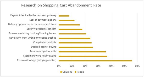
Image Source: Image Source: MotoCMS
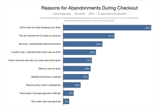
Image Source: Image Source: WPForms
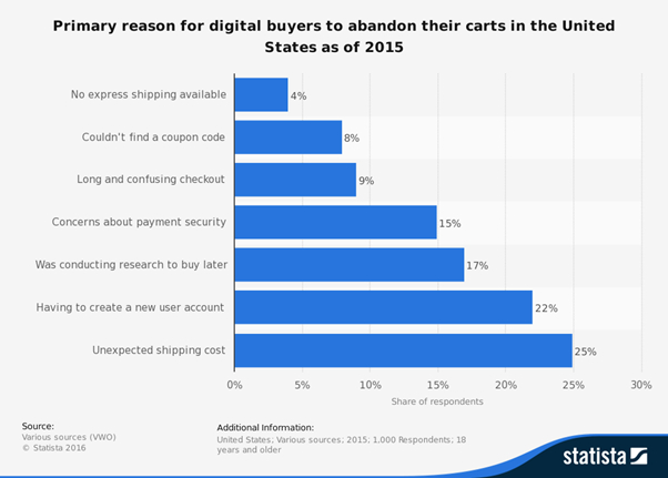
Image Source: Image Source: Barilliance Ltd.
From all three sources over a 5-year period the main reasons for not purchasing were:
- High or unexpected delivery costs
Recall that Amazon Prime converts at 74%, WITH FREE SHIPPING. - Creating an account or complicated site.
This and the factor above accounted for between 45-84% of the abandoned customers! Optimising and improving shipping and ease of purchase could reduce the shopping cart abandonment by 50%. Just so we are clear this is equivalent to instantly doubling the sales. - Functionality
Increasingly shoppers are cash rich and time poor. If they cannot see what they want and buy it quickly, they will leave and find a competitor who can provide what they want, quickly and efficiently. Fractions of a second can make the difference between them buying or looking elsewhere. - Security and payment
Having to decide to enter their credit card details’ the customer wants to be re-assured that their payment is easy and safe. Trust marks, genuine reviews and a professionally looking site all contribute to the impression that the potential customer forms of the vendor.
If any one of those elements feels incorrect the customer will leak out of your bucket instantly.
To conclude: a visit back to our imaginary store. With an ecommerce conversion factor of 2% we would need an extra HALF a person to increase the CRO to 2.5%. This may not sound significant, yet it is a 25% increase in revenue that is easily the difference between profit and loss which is why Conversion Rate Optimisation should be the passion of all who sell online.
If you would like to talk to an ecommerce expert about ecommerce conversion rate optimisation, book a call with one of the ecommerce team at Vsourz.


